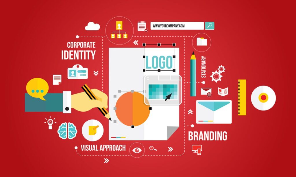
In the world of branding, a logo is often considered the most crucial element in a company’s visual identity. It’s the first thing that comes to mind when a consumer thinks of a brand, and it plays a significant role in shaping their perception of the company. A well-crafted logo has the power to evoke emotions, convey values, and even influence consumer behavior. In this article, we’ll delve into the psychology behind a brand’s visual identity and explore the importance of a logo in creating a lasting impression.
The Science of Color
Color is a fundamental aspect of a logo, and it’s often the first thing that grabs our attention. Different colors can elicit different emotions and convey various messages. For instance, blue is often associated with trust and reliability, while red is linked to energy and passion. A logo that incorporates a combination of colors can create a unique visual identity that resonates with a target audience. Take the logo of Facebook, for example. The blue color scheme is calming and trustworthy, which is fitting for a social media platform that aims to connect people worldwide.
The Psychology of Shapes
Shapes are another crucial element in a logo, and they can convey a range of meanings depending on their design. Geometric shapes like triangles and circles are often used to create a sense of stability and balance, while organic shapes like leaves and flowers can evoke a sense of growth and harmony. The logo of the Coca-Cola company, for instance, features a distinctive Spencerian script and a red color scheme that’s synonymous with the brand. The shape of the logo itself is a stylized representation of a coca leaf, which pays homage to the company’s origins.
The Power of Typography
Typography is a key component of a logo, and it’s often used to convey a brand’s personality and values. Serif fonts, for example, are often associated with tradition and sophistication, while sans-serif fonts are linked to modernity and simplicity. The logo of the famous fashion brand, Chanel, features a custom-designed font that’s elegant and refined, reflecting the brand’s luxurious and high-end image.
The Importance of Simplicity
A well-crafted logo should be simple, yet effective. A complex logo can be difficult to recognize and remember, which can negatively impact a brand’s visibility and recognition. The logo of the technology giant, Apple, is a perfect example of simplicity done right. The apple icon is clean, minimalist, and instantly recognizable, making it one of the most iconic logos in the world.
The Role of Consistency
Consistency is key when it comes to a logo’s visual identity. A brand’s logo should be used consistently across all marketing materials, from business cards to billboards. This helps to create a sense of cohesion and reinforces the brand’s message. Take the logo of the fast-food chain, McDonald’s, for example. The golden arches are instantly recognizable, and the brand’s logo is used consistently across all marketing materials, creating a sense of familiarity and trust with consumers.
The Evolution of Logos
Logos are not static entities; they can evolve over time to reflect changes in a brand’s values, mission, or target audience. The logo of the technology company, IBM, is a great example of this. The company’s original logo featured a lightbulb, which was later replaced with a more modern design that incorporated the company’s initials. This evolution reflects the company’s shift towards a more modern and innovative approach.
Conclusion
A well-crafted logo is more than just a visual representation of a brand; it’s a powerful tool that can shape consumer perception, evoke emotions, and even influence behavior. By understanding the psychology behind a logo’s design, brands can create a visual identity that resonates with their target audience and sets them apart from the competition. Whether it’s the use of color, shape, typography, or simplicity, a logo is a crucial element in a brand’s overall visual identity, and it’s essential to get it right.
